I am experienced in Photoshop CS5 and CS6 and have worked with all sorts of tools within both of these programmes. I wanted to try produce a practice album cover before I make any designs. I own a Canon 500D and am looking to study Commercial Photography Within Europe next year at university, therefore am experience in the digital photography I produce and have created something I believe are up to a really good standard. I wanted to experiment with some long exposure images on people Christmas decorations and my friend Joseph in the photography studio. These images are then going to be used for manipulation and I will add text to create them into individual album covers for some of my favourite songs and songs within my genre.

Although I work well behind the camera of still images I am not experienced in creating album covers therefore it would be a good time to practise I think. I am going to use pictures that I have taken never the less I will have to use some images or silhouettes from Google if appropriate as they will relate to the songs I am going to practise with. I am going to design fonts myself as well as sourcing them from dafont.com in order to get a font for each album that represents the images and song throughout.
I then looked at the images I have created by layering and changing the overlay style and thought about which album cover would suit which of the songs I had in mind to put on my practise album. I then looked at this and analysed the songs I had in mind before moving on to Dafont.com and creating my own typography. I chose around 10 songs to put on my album to give me an idea of what I wanted to design on my actual album cover. This gave me a starting point and an ending point for the album. I wanted to use photoshop manipulation and physical design through sketching to create the designs because they are two different mediums I could use for the final piece. I am going to use a mix of these mediums and photographic image to complete my digi-pack.

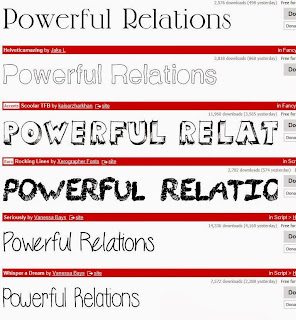
These are the typography examples from dafont.com I collected for the front album covers. I wanted to go with Powerful Relations as a test title because the set list of songs I chose to put together for my album has continuity through the use of theme. Each song has some connotation or direct connection to love, through family or a love interest. I didn't want to specify to a partner because there are family bonds within the songs therefore relations was a better word for it, I chose to use the word powerful because the songs all represent a feeling, a feeling that is able to target an emotion to the audience and to the people listening to it.


These are the original covers from the albums of the singles I have chosen to put into my practise album. I wanted to collaborate these because it would give me an insight into what they are like before I create ones to represent the songs. They are very arty and creative and therefore I want to add more graphics into them instead of using photographic elements. I wanted to use drawings that I could manipulate in photoshop to create my practise pieces. I also used sources from google image such as a silhouette in order to create a picture of a wolf.
These are the titles that I chose to use for my songs and the fonts I chose in them. I will use these for the final mini covers I have built for them for the textual typography.
After using manipulate techniques in Photoshop CS6, I used the images I took and merged together from my previous session and added dafont text and text that I created myself. I did this to give me practise on photoshop in order to learn how to do it for my final music video digi pack. That way I have more experience. The way I have produced this project for myself I think that I have learnt a lot about my work and how I will produce my digi pack next year.
Where I went after creating the images
Manipulations from
Lauren Mabbett
I then took it to the net design, I used a net design from a book on the internet and placed my experimentation s onto it to give me practice on how to do it in the future for my music video digi pack.


