I chose to produce a music promo package for an already established song. The song I chose was "Cody Simpson - On my mind". I took the original video and sound and remixed the narrative, the style and the genre of the song slightly through digital manipulations. I undertook planning and research stages to create my production and once finished the final version of my video uploaded it to Youtube.com. I then chose to create a six panel digipak for my fictional artist and a magazine advertisement to then help promote the products. Below I will evaluate my media texts on the effectiveness of use of conventions, how the products work cohesively and the use of digital media during all stages of production, I will contrast this with audience feedback.
The original song is very upbeat, bouncy, happy and about finding that person you have had on your mind for a sometime. The narrative of the video is Cody himself in a supermarket when with a group of friends finds a polaroid picture of a girl. He is then on a search with his friends to find this girl whilst you see the girl and her friends also in the supermarket. After advertising her face with a time and place to meet they come together at a theatre at the end.
I followed the original conventions of the original video slightly with the images of the love interest, the search and the ending of the two meeting however I haven't followed any of the camera shots, styling, mise en scene or the style of music either.
Before I started looking at other options such as using covers or replications of his own song from Cody I looked at iTunes and the acoustic pop that is available and the songs within them.
Music and Soundtrack
I chose to replace the original with the acoustic cover that Cody also performs with Tyler Ward. This is an unconventional thing to do in terms of replacing the pop classic with a cover however it fit the purpose of my concepts more and what I wanted to portray as a music video. I then made it more unconventional even further with the fact I adde extra layers of tracks onto this cover to add a female vocal.

This would be very unconventional and it is rarely done, therefore to make it conventional to my genre I added it on top and then portrayed it as a bonus track featuring a boy (Jamie) to make it make sense and connect as a package.
I feel this was successful and although isn't conventional to do with a music video felt it matched my work appropriately.
Witihin my music video I used a wide range of conventions to make my work look as professional as possible. As I have stated in my genre conventions post earlier in the year, there is always a connection and a link between the lyrics of the song and the visuals, this is common to keep a solid narrative. This also creates a link between the artist and the song selling not only the product to the audience but the artists too. Having the artist or an actor perform in the video is essential to sell the artist as an individual, the cinematography and editing used is usually related to the video and cut or shot in time with the beat. This allows the audience to connect with the dominant personality of the video. I have done this through a presentation to show you:
Camera Shots
My Main Influence - Romantic meeting video inspiration
Love Story was one of my inspirations for creating a fairytale daydream. When I was younger and saw this video I felt as though I wished I could be that princess like character in the video therefore I felt that this music video for my a2 piece was the perfect opportunity to pass on that feeling.

These are all conventional pop camera shots of a romantic meeting. Other video inspirations of mine were artists such as Katy Perry.
I looked at her video 'Thinking of You' This is where I got the inspiration to do my 180 degree pan shot.


Carly Rae Jepson - Tonight i'm getting over you
This is another inspirational video for the romantic meeting shots as, just like the Katy Perry and Taylor Swift shots, are conventional pop video shots. The arm wrap or hand on the cheek shots are the main features when you see a couple in a video that connotes a romantic connection.

I wanted to capture these moments that are conventional in the music videos I have looked at.

The meeting was different to the one in Taylor's music video as I wanted it this way. I wanted to see both people and both expressions when they came together as a duo. That way I could cut straight to a close up or a pan of the couple once they had met. I felt an over the shoulder shot wasn't as appropriate as the one I chose and filmed with a simple mode of address.
The holding of hands


The holding of the hands shot is something people find personal, when the fingers are interlinked people find it more of a passionate thing to do than hold with fingers closed. I did the close up of the hands after looking at not only Taylor Swift' music video but also Demi Lovato - Give your heart a break. I felt this video showed the hands in a very nice position however for my context of narrative and the situation of my talent it was best to have a more subtle approach. I added a cross dissolve with my hand image, a close up and a more zoomed out shot to emphasise the coming together of their hands. Following the narrative she doesn't know him in reality as more than a passer by she has a lot of feelings for therefore a full embrace of the two would be slightly off course for my narrative and could portray relationship characteristics.


The final image I looked at when planning for the end of my music video was the shot of the realisation. Taylor swift has her own realisation here as she sees her love interest outside of the location she met him in. In the narratives case this is similar however in different situations. Although the print screen of Taylor view doesn't portray it very well, they both have good endings.
This is another strong convention of Pop music videos, they have happy endings. This is due to the upbeat and positive nature they portray to their audience. Pop artist can generally be followed, idolised and listened to by extremely young ages therefore they, as role models, wouldn't be able to provide negative views all the time as in that particular industry they wouldn't make money.


The whole first section of my music video didn't come from looking at any other ideas or other peoples music video's. I understood pop conventions through camera shots of getting specifically the close ups of the situation to describe the narrative and took my knowledge into my own hands. Following no storyboard due to a sudden change of plan, no previously created work and no inspiration apart from my imagination this time, I went about the videos with the attitude of 'Would I like to see that on a screen? Would I watch it again? Does it show expression and describe the narrative enough?'


I used the stereotypical mise en scene of a college to film the drop of the books/papers footage. For many years this trick has been used in romantic comedy's to true chick flicks along side music videos all the time. It is a way for one person to get eye contact with another whilst picking up the items after a nervous drop or fall of props. I wanted to include this as it is featured in things that all age groups will be aware of therefore people will think they will know whats coming ahead, that's when the plot twist of the dream comes in.
Colleges, schools and hallways are very common. They are often used as a 'do not do' instruction for many students as they are repeated over and over again. I was fully aware of this however as a convention of the style of narrative, video, genre and setting the school hallways was perfect for my knock of the papers footage.
I found this video after creating my video and uploading it to my page as it showed up in similar videos, this has the type of drop I had in mind when creating my music video:

I used this idea and came up with the closing and opening of the eyes in my narrative as the lyrics also correspond to the actions I have created for them.
Polaroid Ideas, Research and Editing
When thinking about how I was going to involve Lily's (Elle's) feelings for her love interest in the view on a slightly extreme level and came up with the diary I wanted to include the technique I used in my transition task or similar to portray this. One Direction performed something similar in their video of old family photographs. They used the originals and produced the same setting but with the characters in the photographs later grown up, This was then pushed further to come to life, see video at 0:54:00 seconds.

Another way I could of portrayed this to match others conventions is how I made my starter task of the year with Katie Smith. We created polaroids physically with card and then took photographs of them, We then put the videos we recorded inside them via the editing suites to make it look as if the photograph was playing. One character was frozen inside and the artist was performing around them.
I felt this would of worked well however as I didn't want the videos to replicate memories but for them to replicate the imagination I needed a different way of looking at it.
To not be conventional and for my video to challenge conventions I produced drawing type images in the polaroids as if Elle as Lily had drawn them and then played them in her head of what could of happened between the couple. I deliberately did this and explained this through the use of colour to my audience. Very dull, almost black and white being reality and colour being the dream.
I chose to use the drawing on a polaroid and the Zoom editing in Final Cut Pro on my macbook to make it look as if the audience are physically getting zoomed into the picture to see what happens. I also did this so that the camera is on an eye line match of the diary.

Colour
I used colour in my video to represent different periods of time, different locations, situations and the different between Elle's imagination as Lily and the reality that she lives.
I thought showing my video this way will make my complicated narrative hopefully easier to understand with this concept. I felt that changing conventions in pop music videos will make it more interesting. As I already challenged the conventions of a pop music video with my sub genre cover and extra vocal layer on the soundtrack, in order to keep that slight sub genre and it making sense I was therefore going to have to edit my video so that it backs up both sides. The main genre being Pop but a slight input from independent sources with the type of acoustic sound.
I think the colours therefore represent this.
I chose not to use full black and white as I felt that this would deflect some elements of my video and not highlight them such as the diary and the papers at school, the costumes slightly from the two of them also was something I didn't want to burn out.
Editing
The most commonly used conventional editing techniques that feature in pop music videos are jump cutting. This is so that when an artist swaps locations from one place to a completely different place is it normal to do so and the audience would not question it as it is a convention. Jump cuts are better at making the locations stand out rather than using transitions in editing such as a cross dissolve or fade which would blend the two locations together. Reaction shots are captures, slowed down and sped up in the editing process to express the relationship between two or more characters. Another important convention is that the pace of the editing goes in conjunction with the movement, This means it would be in sync with the beat of the track so the music video fits well with the music.

A convention also of music videos is the editing of the artist, due to me not having the software to be able to do that to a great deal or not having the skills to be capable of doing so I applied makeup an adjusted hair as I went along in my shooting. I wanted a very natural look on Elle and Jamie as they both are portrayed still fairly young in the video possibly around the age of 16/17. It is a very young based video therefore having harsh makeup and dark images passes off the wrong idea and wrong ideologies of my talent.
I did boost my colours in the video to a high saturation for the dream and -0.82 on iMovie for colour reduction in the reality sections.
Digipak


- Barcode
- Copyright Infringements
- Artist Webpage
- Dates of year
- Label logos
- Tracklist
- Album Title
As seen in 'The Making of my Ancillary Text'
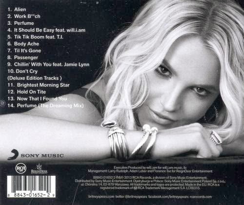
This back cover from Britney spears was my inspiration for the back cover of my own digipak.
I used the bottom set of copyright information as a guide as to what to write on my own to make it look professional and keep verisimilitude between my design and other pieces people use in the industry. I first positioned the writing on a side as I thought it would be most beneficial in this area however later changed it again back to its original position due to the use of space and using the digipak template net measurements.
The measurements were then fitted and the composition of the piece was shifted for this to match a professional digipak by the net.
I made sure whilst creating my CD's I had full logos, emblems, copyright messages and information on to make my products look as professional as possible.
In order to be able to create a professional looking CD to go inside my digipak I researched music labels (see other post for Chosen Music Label.) I wanted to create a realistic digipak that could be sold in shops as a product that could fit in with a pop genre however have an alternative styling edge to it. I have created my CD's with the following products:


I also knew from previous research that Michael Jackson was also signed to the label Epic which is my chosen record label a subsidiary of Sony. The smaller label has some of the biggest well known artist in the work therefore I knew all their work would look professional. I took from this the style of the emblem and coding on the right hand side.
I want my work to mimic an original disk therefore by finding logos or creating with the text tool I was able to compose one of my own that is original.

The CD template I found on www.wizbit.com above was a huge help for me because I didn't know how to set out a CD before taking on this task. After googling and finding the wizbit disk I knew exactly where to place my imagery and text. With this in mind I started to design my copyright writing with the use of pathways on Photoshop CS6.

I did this on the inside of the disk rim, I put the copyright signs on the inside due to this been the conventional thing to do on a CD.
The disks from Sony also feature the collection of writing, symbols and emblem logos on the right hand side therefore this is where I placed mine. I used the logos below to collaborate and compose them as a group on my disk. I have used this on both my CD's however in different places due to the detail on my disk photography.


Tracklist conventions;
All information is on 'Creating my Tracklist'. The track list I created was fully inspired by likes of my favourite pop artists. I searched their albums in google to find all of the names of every track ever written by them in their albums. I found this very useful as I could browse all of the names and as well as make my own up, I could look for inspiration or take romantic or life related track names to build up my playlist. I looked at Britney Spears's album back to set this out before going to dafont,com to retrieve font styles to manipulate them in Photoshop.
Front Cover Conventions:
I made sure I followed conventional characteristics of my genre in my front cover however believe that my sub genre of an alternative acoustic came more into this through my personality. Generally the front cover of a digipak has an eye catching image that is connected to the lyrics of the album, the track list or the artist themselves. I did exactly this. I featured Elle, as Lily, on the front of the cover using mixed media techniques. I used photography along side photoshop digital manipulation and illustration of my own combined to create an image of her I was able to use for my cover. Inspirations for my front cover were:


As a graphic designer I love this style of work as it mixes my favourite types of platform/mediums together. I love the colour involved in the one above however knew I wanted to keep mine subtle and with in a house style that I chose of black, white, gold and the occasional use of red.
Following these illustrative design conventions of the sub genre I collaborated with my pop piece I drew my own ideas coming out of Elle's head. These are mixed media based also after being digitally manipulated into photoshop. I wanted to, like the one above, show the girls personality and imagination through the image, following the conventions I feel I have done this successfully.Poster:
I didn't particularly have any inspirations for my poster I simply worked with what fit however felt it would be best to use one photographic image to catch the eye of my audience but not using anything too graphic. Simple but effective was the approach I was going for. I knew that Ellie Goulding's poster had this convention therefore I looked at her work before constructing mine.

I set my image and title similar to Ellie's and then worked my own work around them in Photoshop CS6. I looked at existing posters, also that are on my blog, and found the most common conventions to place on an album release poster. These were a rating of some sort from a company, where it is available to purchase from, a quote about the album or digipak, the release date, music label logo and a web address for the artists. I therefore made sure I had all of these on my product.
I positioned it and added colour to at least two parts of the text on the poster as I felt that this stood out and the colour was following my house style keeping continuity. I felt if I promote the artists webpage and the release date in the colour this is what the audience are going to look at first if this was eye level on a poster.To test this theory I put the poster into various locations to see if it would be eye catching enough to the audience, this is conventional for posters to be advertised for promotion. I felt these images were most appropriate for my work as that is where they could be advertised in real life situations.


No comments:
Post a Comment