My ancillary text will be an illustrated digipak with elements of photography within it. The colour scheme will be gold white and beiges with black titles on the front cover. This is a connotation of success. The definition of gold; Gold is the color of success, achievement and triumph. Associated with abundance and prosperity, luxury and quality, prestige and sophistication, value and elegance, the color psychology of gold implies affluence, material wealth and extravagance.
This is found at http://www.empower-yourself-with-color-psychology.com/meaning-of-colors.html
I want to show the connotation of achievement in this EP, that my artist has put her everything into creating this album and is proud of the final outcome.

By drawing some of these ideas up I will then be able to think about how to lay them out and collage them. I can do this through the programme Photoshop CS6.
I can use the layers tools to be able to collage all my images together. I am very capable with digital manipulation therefore I feel confident enough to produce a solid final piece this way.
Turning my photography into illustration (Elle's body)
I used the How To geek profile on google to find a tutorial on how to do the process through photoshop which eventually made it look very much like an illustration which was my best aim.
The link to the tutorial: http://www.howtogeek.com/68762/how-to-make-photos-look-like-pencil-drawings-in-about-one-minute/
The final image from the editing shown above.

I wanted to experiment further and see what the image would be like on white therefore with editing tools such as the marque tool, eraser, gaussian blur tool and levels I created the image below. I then started to add the drawings I drew up and scanned in to begin my imagination collage.
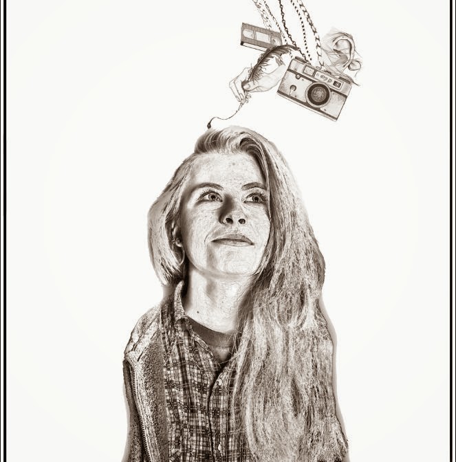


A camera, dreamcatcher, hand actions, cards, a pocket watch, a rose, a feather held by a hand, video tape, anchor, a couple kissing, chains and an ear surrounded by hair.
By drawing these things I was representing something in each one. I am responding to songs I have chosen for the track list or creating a solid narrative through the image. For example the anchor is a sign of stability and family, the rose a sign of passion and devotion and a camera for the song I have chosen to include 'Picture'. This also connects to the props in my music video, the polaroids, how the images capture Elle imagination as Lily Tomlin about her love interest.

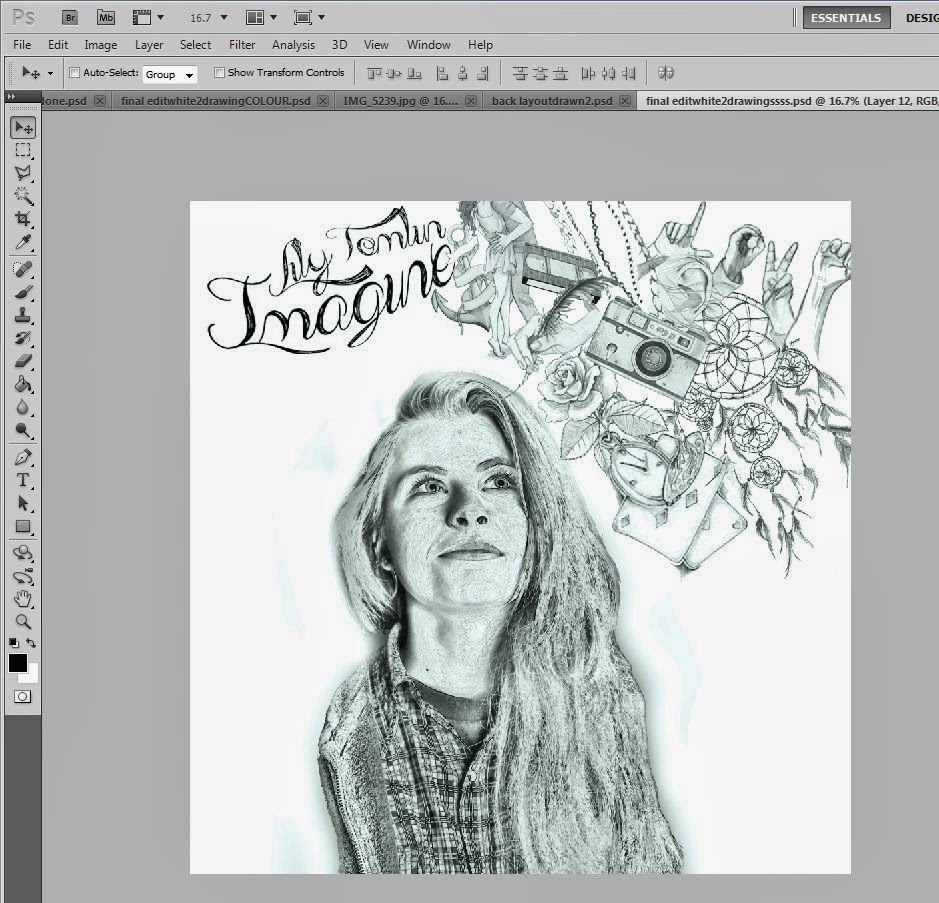
I have also added the chosen text font from DaFont.com which I added to a previous blog post and positioned it above Elles head along with the drawings to represent her imagination.
The next part of my ancillary text I am going to do is add colour to my designs so that it could stand out more to the audience and the images are easier to understand.
There is a difference between the original created compared to the images uploaded to blogger, due to the image I have created not having a sepia tint on it, therefore I have uploaded the image below to show that it is actually clear black and white from a print screen. I am not sure why this has happened on the images uploaded above.
Once Colour was Added


The red lips will be complimentary of the rest of the work and will also be a strong connotation of the love album, passionate, powerful yet dangerous due to my music video over exaggerated concept.
I used the marque tool to edit the lips and painted over them in a lowered opacity of red blocked colour. This made sure they were not too bold and didn't take away the detail of the lips that I was hoping to keep.

To add colour to each of the drawings scanned in I zoomed and used selection tools to carefully go over the shapes that I wanted to work upon and fill.
I then used texturing tools in the filter section of Photoshop to add a tone to the rose on a low opacity and then painted over on a 19% red pen. The ribbon on the anchor was my favourite part of the drawings to colour in as I think it has bold symbolisation and puts across my point of view about the album clearly. Overall i think that the album is better in colour than in black and white as a front cover as it gives it more personality.
I then used texturing tools in the filter section of Photoshop to add a tone to the rose on a low opacity and then painted over on a 19% red pen. The ribbon on the anchor was my favourite part of the drawings to colour in as I think it has bold symbolisation and puts across my point of view about the album clearly. Overall i think that the album is better in colour than in black and white as a front cover as it gives it more personality.

Aswell as having used Claire Rollet's technique of physical digital drawing on buildings at castle howard I wanted to experiment with my actress and actor to see if it would be worth using as a cover page or a lyric booklet image. I used the find edges tool on photoshop along with the pen tool, eraser tool and opacity of the image to create outlines of each of my character and then put them side by side one another replicating a scene in my music video.


I had to remove the original background to begin with to be able to start the find edges process due to the fact there would be too many lines to pick up and it wouldn't work properly for what I wanted to do.

The next part of the process is to apply the find edges. You have to click on the selected layer on Photoshop of which you want to edit, go to filter, apply the converted filters. Repeated clicking filters and go to filter gallery. In there in find edges which give this effect shown on the left. The final image with lowered opacity is here.
The final image with lowered opacity is here.
I repeated the process with my actress however it was harder to follow due to the thin strands of hair in the curls my actress had. I did the same by removing the background with the quick selection tool and delete key and then moved on to editing.


Due to my final image not bringing out lines very well on my actress I then went to image, adjustments and clicked levels. It was here that I was able to make the lines a lot more bold and dark before applying any other effect to it. I feel that this was a lot clearer than the other one and once there is an image behind it, it will be a much stronger piece of work.


Other things I could include are the photographic imagery that I took in the studio. I did this to purposely be able to play with them in photoshop and experiment with colour schemes. I used the same technique as the one I did on the front cover of my ancillary text here and then put the original image behind it on a 20% opacity to create this final edit. I like this because of the posterisation style and cartoon look it has about it. I was aiming to capture her imagination in a picture, as if she is falling from a day dream or a happy thought. I used a fast shutter speed and low ISO to capture the hair in the position it is in and then edited the colour through Photoshop via Colour Look up and saturation levels.

I used a 25% opacity on this image behind the drawing style so that the texture in the face and ribbon of the mask were still visible, this is important as then the audience could understand what is happening in terms of my continuity and expression.
I am going to experiment with the photography and drawing styles so that there is plenty to work with once I finally put together my ancillary text to put out to the public opinion.
Creating CD's with Chosen Music Label
In order to be able to create a professional looking CD to go inside my digipak I researched music labels (see other post for Chosen Music Label.) I want to create a realistic digipak that could be sold in shops as a product that could fit in with a pop genre however have an alternative styling edge to it. I have created my CD's with the following products:


I also knew from previous research that Michael Jackson was also signed to the label Epic which is my chosen record label a subsidiary of Sony. The smaller label has some of the biggest well known artist in the work therefore I knew all their work would look professional. I took from this the style of the emblem and coding on the right hand side.
I want my work to mimic an original disk therefore by finding logos or creating with the text tool I was able to compose one of my own that is original.

The CD template I found on www.wizbit.com above was a huge help for me because I didn't know how to set out a CD before taking on this task. After googling and finding the wizbit disk I knew exactly where to place my imagery and text. With this in mind I started to design my copyright writing with the use of pathways on Photoshop CS6.

I did this on the inside of the disk rim, I put the copyright signs on the inside due to this been the conventional thing to do on a CD.
The disks from Sony also feature the collection of writing, symbols and emblem logos on the right hand side therefore this is where I placed mine. I used the logos below to collaborate and compose them as a group on my disk. I have used this on both my CD's however in different places due to the detail on my disk photography.


For this imagery and the background I used my long exposure photography that I used for my digipak practises and then used the blending modes on Photoshop to be able to merge it together with the background.
I am pleased with my final outcome as its simple but effective I think. It makes my artist look innocent as well as a professional pop artist.
I chose this imagery as it was a bit more serious and different to the types of drawings I have used in the rest of the album. I wanted to mix up the use of media and experiment with different ideologies. Having the mirror in the image is a connotation of her looking at herself in reality as all we see of her in the video is her imagination and her thoughts. This is a sign of her in reality before we see the ending of the music video. She much prefers her imagination.
Back Cover
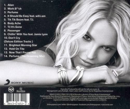
Like the slide shows in the prezi the layout of the digipak was from conventional use. This back cover from Britney spears was my inspiration for the cover.
I used the bottom set of copyright information as a guide as to what to write on my own to make it look professional and keep verisimilitude between my design and other pieces people use in the industry. I first positioned the writing on a side as I thought it would be most beneficial in this area however later changed it again back to its original position due to the use of space and using the digipak template net measurements.
The measurements were then fitted and the composition of the piece was shifted for this to match a professional digipak by the net.
I also had to change the measurements and designs of the front cover to fit the digipak net, this was because used a 25cm x 25cm block to design in on photoshop when the image was more rectangular. I didn't want my image to be off centre therefore adjusted the composition to get my final design below.

The Spine
The spine of the ancillary text was the last thing I created due to it being the smallest part of it. Here I brought back the use of my digipak practise photography and integrated them into my designs. I used the scribbles that I introduced in the back cover at first into the patterns I had already collaborated from the photographs to produce a background for my spine.
My Final Digipak
This is my final digipak that I have applied to my net in order to print and receive feedback on. I did this also via Photoshop CS6.


The Album Promotion Poster
First whilst creating my poster I looked at possible designs that I could use from the sources in my digipak. I felt this wasn't working due to composition to therefore decided to look back to my old work of Elles photoshoot at the photography I took that day.

I used the style and images from the front of my media ancillary to be able to produce a poster design and used the stripped lines as a connection to the rest of the album as it features this as well. I felt after producing this mock up that it didn't feel right and it would be very difficult to create a poster with all the information on that is needed for a digipak promotion poster with a structure like this.
This is when I went back to the drawing board with my ideas and looked further into the designs and photography I had previously taken.


Taking the photography I used on my inside cover I got to work on editing it as a final poster.


I look at the materials that I used for my digipak and what I needed to promote my single and my full album including my music label therefore I decided that I had to use these in my poster to make it conventional and professional all at the same time.


I wanted to feature the main title, obviously, as without it the audience wouldn't know what the album was called. I kept the same font style as I know that it would be a lack of continuity to change the font just for the poster.

Above is the photoshop edit that produces a drawn layer for the image, The steps seen above in the previous part of the ancillary posts show how I did this. I used this template ontop of my photography to create a piece that was able to be eye catching to the audience. I felt that the image expresses the hyper reality that we see the world as, that we see other people in. The un defying gravity that is apparent and her imagination taking over control.
The hand on her heart is a connotation to the album, her love for her work, her supporters and a direct connotation to the boy in my music video, the love interest.


For my poster I thought about all the things that I had to conventionally put into my music poster, these being the title, the date it is released, the artist name and extra logos that are needed such as where the track is available from and what music label the artist is from.
Having used these before I placed them in last, I knew I had to get a compositional structure therefore using the Imagine title as placement I messed with that first before placing the rest of the information. I also added a website that Lily is supposed to have to make her as an artist look more professional.
My Final Poster Design

My Ancillary Texts - In the real world
With the help of www.loonapix.com I was able to put my products in frames making them look like they're in the real world.
As well as that I edited my work so that it looks like my album is for sale in iTunes web store, this makes it look a professional product. I put my product in the POP and Singer/Songwriter sections because of the way I have produced my work I feel that it is appropriate to both genres and both set of audiences.


I feel after looking at these photographs of my imagery that it does look like a professional piece, it is effective, eye catching and it doesn't look too busy on the page which is what I was aiming to avoid.
No comments:
Post a Comment